When it comes to email service providers, ConvertKit (one word, not two!) stands as one of the best, most capable and elegantly-designed solutions for bloggers and email marketers that exists in the industry. It’s not perfect, but it’s darn close.
In this ConvertKit review, we are going to take a deep look at ConvertKit and all of its features (including its new ones!), critique the design of the product and why ConvertKit might (or might not be) right for you. Pros and cons at the bottom.
I’ve used ConvertKit for years. I’ve also used competing services like MailChimp and GetResponse, and they all have their pluses and minuses. But, there’s a very good reason why I’ve chosen to stick with ConvertKit as my email marketing provider.
If you’re ready, let’s get started.
ConvertKit Review: What is ConvertKit?
ConvertKit is an email service provider used by bloggers and organizations to keep, manage and exploit their list of email subscribers. With ConvertKit, email subscribers can be tagged and segmented, which helps to organize subscribers into logical units.
Automations and rules can automatically tag subscribers and add them to sequences, and link triggers give marketers the power to automatically organize subscribers based on the links that they click within emails.
In other words, this stuff is super powerful.
Among its many features is the ability to create opt-in forms (here’s how to create one that converts like hell) and landing pages to collect email addresses. We will talk more about this later, but suffice it to say they have some of the most well-designed templates to choose from so you’re not starting from scratch.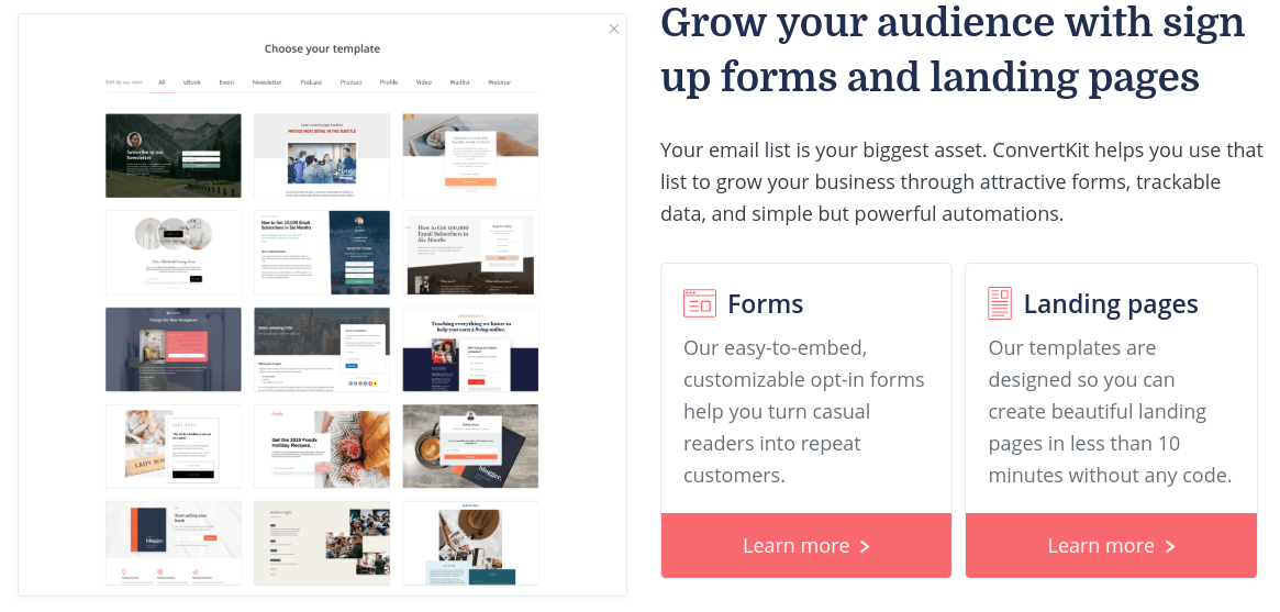
Sequences in ConvertKit are a breeze to set up and are one of the many features that truly sets ConvertKit apart from other email providers.
A Sequence is a series of emails that are automatically sent in order, often with a customized time delay between each one (ie: once a day, or once a week but only on Thursdays, etc).
And if you use WordPress, ConvertKit offers a plugin that will seamlessly connect with your ConvertKit account. This makes it easy and quick to pull in opt-in forms and landing pages so they integrate neatly into your blog. If you don’t use WordPress, no need to worry. It’s easy to integrate forms and landing pages into any website.
I will show you how everything works throughout this review. Let’s take a closer look at the major features of ConvertKit.
Major Features of ConvertKit
ConvertKit offers a slew of features that were specifically designed for bloggers. If you’re a blogger, you’ll quickly learn to love its design and usability.
Forms and Landing Pages
Forms and Landing Pages are the bread and butter of any email service provider. Without forms, bloggers can’t entice subscribers to sign up. Most service providers offer forms, but ConvertKit’s are among the best-designed, and their form customization tool is top-notch.
To create a new form, ConvertKit offers three basic types: Inline, Modal and Slide in.
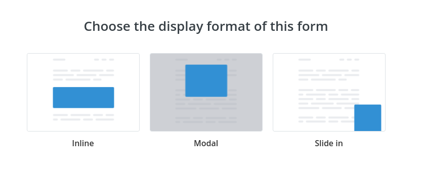
- Inline: Meant to be placed directly on the page in content or in the sidebar.
- Modal: Popup forms that are triggered based on an event.
- Slide in: Forms that will slide in (animated) from one of the corners.
I use Inline forms the most. Each type of form comes with pre-made templates and each template can be completely customized so it blends well in your blog.
Take a look at some of the customization options available for a modal form in the below screenshot. Display options configure when the modal window should appear. But, ConvertKit also offers a link that readers can click to automatically trigger the form.
Talk about cool!
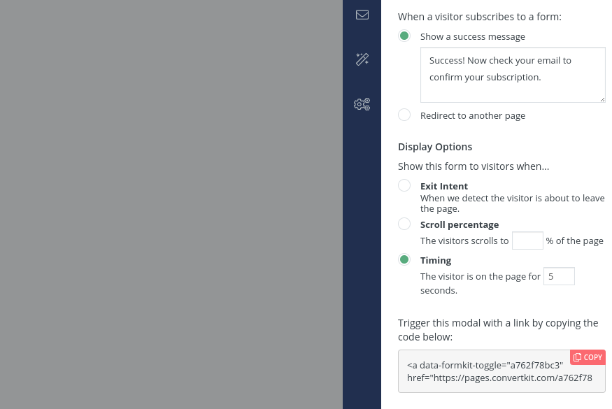
You’ll be able to take full control over your opt-in forms with ConvertKit. In fact, take a look at the blue sign-up form on my homepage. That’s a ConvertKit opt-in form that I’ve heavily customized for my site. 🙂
Landing pages, on the other hand, fill the entire page and, like opt-in forms, come with a bunch of pre-built templates and customizations to choose from. I’ve always been able to find a template that fits my exact needs.
They just released a bunch more templates in 2019.
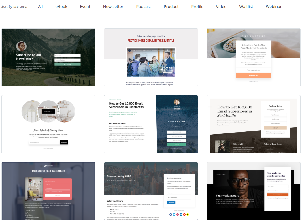
Landing pages can be hosted by ConvertKit through a dedicated link (here’s an example). They can also be integrated straight into your website or blog using your own URL.
With landing pages – lots of customization options like custom images, font styles and sizes, colors and even a place to hard-code your own CSS adjustments.
The customization capabilities are what makes forms and landing pages so powerful in ConvertKit. Start with a pre-built solution, then customize to your needs.
Tags and Segments
ConvertKit doesn’t support the relatively inflexible idea of separate email “lists” (like other email providers). In essence, all of your email subscribers in ConvertKit are in one large “master list”. However, tags and segments are how marketers organize and group subscribers based on a whole slew of criteria.
And, this is another feature that separates ConvertKit from the rest.
The ability to tag and segment lets marketers group email subscribers based on certain behaviors. For example, bloggers might tag certain subscribers based on an area of interest. Then, emails can be better customized and delivered to those subscribers who are more likely to care about the topic.
Writing tailored and customized emails convert much higher than generic mailings.
Once bloggers and email marketers begin to use the power inherent in tags and segments, very few of them go back to the less flexible “email list” concept.
Sequences
If there is one feature that completely sets ConvertKit apart from any other email service provider, it’s how easy it is to create email sequences.
Sequences are emails that, as the name implies, are automatically sent in a sequence – one after the other. A time interval controls how often the emails are sent and emails can be reordered on-the-fly through an insanely easy interface.
An example of a demo sequence is below.
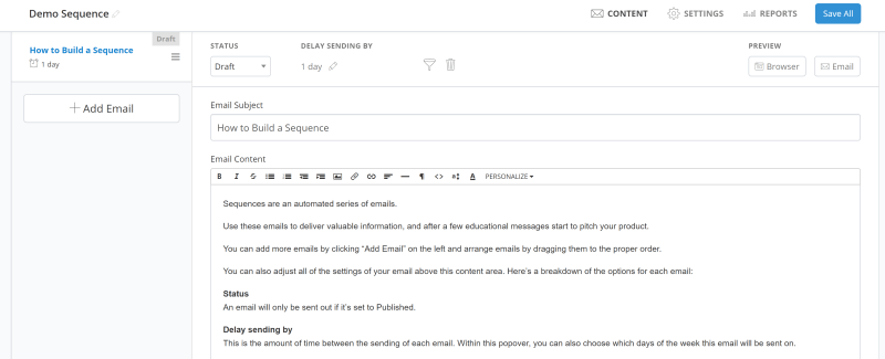
On the left, new emails can be added quickly and easily by punching the ‘Add Email’ button. The ‘DELAY SENDING BY’ specification toward the middle controls the time interval between that email and the previous one.
Email sequences are as easy as creating a new email, writing your email content, setting a time interval and publishing the email to your sequence (by adjusting the ‘STATUS’ drop-down box). It’s really that easy.
Other email marketing providers make you specify rules and automations to implement sequences, but in ConvertKit, it’s much easier and the interface will save you time.
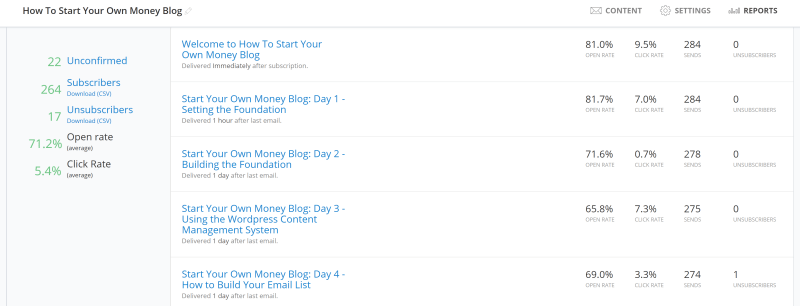
And, you can track statistics on a per-email basis within your sequence. Here’s an example of statistics that track the open rate, click rate, sends and unsubscribes on a five email sequence:
Email sequences are excellent for welcome emails after a subscriber first joins your list as a way of hitting your new subscriber with important information about you or your product/service.
They are also a “no-brainer” choice to implement an email-based course that teaches a subject one email at a time. For example, a “5 ways to get rich fast” course – one email every day for five days – delivered neatly and automatically by ConvertKit. Just set it up once and you’re done.
And, it’s literally never been easier than using ConvertKit email sequences.
Rules and Automations
ConvertKit supports automations in a similar fashion as other email service providers through a point-and-click interface that defines a particular logic flow.

Automations differ from Rules because they are a more powerful way to automate your email marketing through conditions. For example, “if this is true, then do that“. Automations make it possible to make more complex automated judgments based on events – or, things that happen (ie: a subscriber clicks a link or buys a product).
For example, marketers could use an automation to send specific emails to different email subscribers based on whether or not they clicked on a link in a previous email. If they clicked the link, send email A. If not, send them email B instead.
Check out ConvertKit’s automations page for more details on how automations work. They are super powerful but take some practice to get right.
Rules, on the other hand, are more straightforward and simple ways to tell ConvertKit how to handle events, and I’ve never seen a more intuitive solution.
The rules page (pictured below) works on a “trigger -> action” platform. When this happens, do that. It’s simple. It’s streamlined. It’s super easy.
And, most bloggers’ marketing needs are simple enough that rules (rather than more complex automations) are all that most of us will need.

Integration with External Tools
ConvertKit works natively with many different tools to make email management a breeze even if you’re using another product or service with your blog.
For example, many bloggers use the Teachable system to house courses and other educational material. ConvertKit connects directly with Teachable to automatically import Teachable students into ConvertKit.
Other integrations include:
- Gumroad
- Zapier
- Swipe
- KingSumo
- Leadpages
- And so, so many more
Check ConvertKit’s integrations page for more on what products and services that they natively support. Integrations are a critical component of email marketing.
What I Like About ConvertKit
There is a lot to like about ConvertKit. It’s one of the most well-designed email service providers built with bloggers in mind. The features are straightforward and easy to use, more so than other email providers. In some cases, it’s night and day.
Here are several key things I love about ConvertKit:
- ConvertKit is usable. The interface is simple and organized in a way that makes sense and that minimizes the number of clicks it takes to accomplish a task.
- Email sequences are a breeze. I’ve never seen a simpler way to create and maintain a series of emails from any email service provider, period.
- Pricing structure is intuitive. While other email service providers have hidden costs and limitations, ConvertKit’s pricing is clear and easy to understand.
- Statistics are clear. Every broadcast and sequence email has the open rate, click rate and the total number of unsubscribes displayed clearly.
- Features roadmap is public. To see a list of new features that ConvertKit is working on, they’ve published a helpful roadmap page.
One of ConvertKit’s newest features is an improved email editor.
In the past, marketers had to know a little bit of HTML in order to fully-customize emails. But, ConvertKit just released a new version of their email editor with WYSIWYG-like point-and-click elements.
Features are being continually added to their new email editor. Notice the drop-down on the left of the screenshot with available elements for your emails.

Note: There are still some things missing from their new email editor, like the ability to customize the HTML when we need to, insert link triggers and take full control over the look and feel of the email. But, ConvertKit continues to release enhancements that make their new editor more and more useful.
What I Don’t Like About ConvertKit
Though I love using ConvertKit, there are a few things that can be improved.
- No broadcast email templates. Unlike other email providers, ConvertKit doesn’t have pre-built email templates with colors, tables, images, and design elements to make your emails look more like webpages. But, they do this on purpose. ConvertKit believes that emails should be simple. If you need to send webpage-like emails, you’ll likely need to spend a little time building those from scratch.
- Support isn’t lightning fast. While their support staff always responds to support requests, they aren’t always fast. I have found that a turnaround time of 24-hours or more is quite typical.
- Can’t easily organize broadcast emails. Currently, all sent broadcast emails are listed on a paginated page. I would love to be able to tag emails, create folders or somehow organize those emails into different types so I can quickly see a list of all weekly newsletter emails, or sales emails, or cold re-engagement emails, etc. You can search previously-sent emails, however. But, I’d love much more organizational power.
- No customizable dashboard. The default ConvertKit dashboard displays a trend graph of email subscribers. It does support basic filtering, but I would love to be able to build my own dashboard that contains what’s most important to me so I’m greeted with that information each time that I log in.
Though ConvertKit is not perfect, it is one of the best email service providers in the industry. And if you’re a blogger, I believe it is the best solution. ConvertKit is intuitive and easy to understand, well-designed and clearly built specifically for bloggers to write a lot of content and want full control over their email subscribers.
If you aren’t a ConvertKit customer, sign up below. I bet you won’t be disappointed.


