I don’t know about you, but I am way more likely to read a normal-looking text-based email than I am one that’s full of images, colors and sales copy. When I open an email full of images, I feel like I’m being sold something shiny. I assume the company is covering up their inability to talk to me like a paying adult by using fancy graphics and shiny
I am a huge believer in
And, easier for mobile devices to download and display.
This is one of the main reasons why ConvertKit, one of the easiest-to-use and well-designed email marketing providers in this business for bloggers, doesn’t provide a complicated email builder like many of their competitors.
Instead, they encourage their customers to send basic, easy-to-read emails through a simple writing interface that’s fast and streamlined.
I like text-based emails because:
- They are easier to write because we’re 100% reliant on the text and not the association between imagery and text, which can lead to confusion.
- They are simpler to design because
text will naturally conform to the screen size of the reader’s device – usually automatically. - They require less work from the reader because they aren’t forced to download images or click a ‘Show images’ button in their email client.
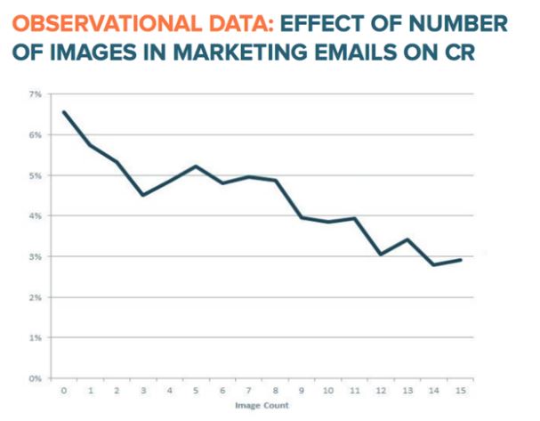
- HTML emails reduce open rates and click-through rates. That’s according to Hubspot who stays on top of this stuff…and conducted an experiment to test what type of email (text-based vs. image-based) performs better.

- Though Gmail now displays images, some email clients won’t. This means image-based emails will look strange. Worse, the email might look broken in email clients that are still set up to block images.
What do emails look like with blocked images? They can look something like this:
I don’t see a problem with image-based emails. pic.twitter.com/3H3PWe7mXO
— Fabio Carneiro (@flcarneiro) February 18, 2015
Uh huh…
If you’re designing image-heavy emails, at the very least offer text-based versions of the same email. And, try not to put anything important in an image that isn’t also written in the email using text.
But, this article isn’t about image-heavy emails. It’s the opposite. I’m talking about my favorite type of email – the text-based email.
Not necessary “plain text”, mind you. It’s okay to use CSS to style your text. To bold it and italicize it. To bullet important lists and adjust the size.
In fact, that’s good. It’s a part of creating a text-based email that actually works.
How to write text-based emails that work
Using text-based emails is an extremely light-weight and effective way to communicate with your email audience. Not only are most email clients less likely to label text-based emails as spam, but they download quicker and give many email readers the impression that plain-ol’ emails will take less time to digest.
Okay, we got it. I love text-based emails.
How can digital marketers get the most out of each word of text? There are several tactics, and I’m starting with the most important one.
Readers don’t read; they scan
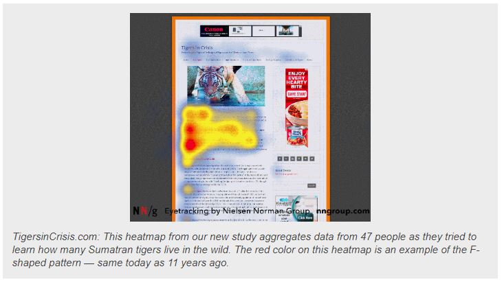
Not only do most online audiences NOT read, but they also scan in a very interesting fashion that sembles a letter of the alphabet.
According to the Nielsen Normal group, many scan in an “F” pattern.

Meaning, many users begin by reading across the page to absorb the first couple of sentences. If they aren’t immediately captured by the text, they will jump down the page and sample more of the text from left to right.
But, they also become more discriminating as they do. If their eyes don’t pick out the most important samples from the page, they are less likely to continue reading.
What does all this mean?
Instead of writing paragraph after paragraph of text that all looks the same, conform to your reader’s natural desire to jump around by giving them visual aids.
These aids include:
- highlighted keywords (hypertext links serve as one form of highlighting; typeface variations and color are others)
- meaningful sub-headings (not “clever” ones)
- bulleted lists
- one idea per paragraph (users will skip over any additional ideas if they are not caught by the first few words in the paragraph)
- the inverted pyramid style, starting with the conclusion
- half the word count (or less) than conventional writing
In other words, make each blog post a visual showpiece. Through the use of bold and italicized text, headings, links and color changes, you’re identifying for the user key areas to focus the eye on and keep them engaged in the content.
Make your text-based emails easy to scan.
Keep emails relatively short
Most bloggers are used to writing long and detailed posts because longer posts tend to rank better in Google. In fact, the average Page 1 result, according to BackLinko, is nearly 1,900 words! Clearly, longer content tends to win the game with blog posts. For the record, this post is right around 1,600 words in length.
But, that same theory doesn’t hold for emails – for one simple reason.
Emails aren’t ranking in Google. It’s not the job of a digital marketer to write long-form, SEO-heavy emails because they aren’t designed for Google, nor do they wind up in Google’s index. Emails are not blog posts.
Instead, emails are designed to communicate a specific and important message that is sent straight to the end user’s inbox. It’s a one-to-one communication between the blogger and the email recipient.
In contrast, a blog post is open to anyone who might want to read it. But, think of your emails as a one-on-one discussion between you and the reader.
Pretend it’s a personal letter to a friend.
In many ways, this is great. Marketers don’t need to worry about SEO. They don’t have to care what search engines are going to think. None of that matters.
With email, what matters most is getting a point across to your reader as quickly and efficiently as possible. With email, brevity tends to work.
But, here’s the thing…
I’m not here to give you a simple rule about how many words your emails should contain. It depends on your situation. It always depends.
It depends on your audience. And, it depends on what you’re writing about. Some topics will require more words than others.
This isn’t about conforming to some “rule”.
Instead, try writing shorter emails. How short? As short as you can write them while still getting the point across to your readers.
Try this for a few weeks and see how those emails perform. If they out-perform longer emails, keep writing shorter ones. If not, go back to what worked.
Tell your readers a story
One of the most effective techniques of writing emails that work lies in the story. People like stories. We like to follow along. They keep us feeling engaged. Good stories keep us around because we want to know what happens.
In other words, interesting stories encourage us to continue reading.
But, writing a good story is also one of the toughest skills to master. Good story-telling isn’t easy. If it was, we’d all be master digital marketers.
What makes a good story?
Well, let’s pretend that you’re launching a new product. It’s an online course about how to plan your next road trip. Things like finding the best route on Google Maps, reserving camp spots, finding things to do and staying within your budget.
It’s a solid product, and you’re ready to write an email introducing the course to your loyal email followers. There are a couple ways to approach this introduction.
Here are two examples of how this email might read:
The non-story telling way
Hi Mark,
I’m writing to let you know that I just released a brand new online course about planning your next awesome road trip. In the course, you learn everything there is to know about Google Maps. And, how to find the best campgrounds and make reservations at campgrounds and find activities to do while you’re there.
It sells for $49.99 and would love it if you took a look.
https://supercoolroadtripcourse.com.
Thanks!
The [better] way that tells a story
Hey Tracy,
Last summer, I took a road trip from hell. At 4am on Thursday morning, I woke up and set sail with my wife and kids. I was driving tired and could hardly keep my eyes open. It was dark and did not have a good feel for the road or where I was going.
And to make matters worse, I wasn’t even sure a campsite was going to be available when I arrived. It was a shot in the dark (literally!). My wife was nervous and my kids were depending on me to make this an enjoyable experience.
After all, I promised it would be!
…
I learned from this road trip. I took my lessons learned and designed a video-based course that teaches you how to avoid the mistakes that I made.
You will learn how to inspect nearly every inch of the road – before you leave by using Google Maps, to make sure it’s safe enough for your RV. Also, you’ll get a primer on finding the perfect campsites along the way and exactly how to guarantee that a spot is available when you get there.
You’ll also get …
…
See the difference between these two emails?
The first one is very matter-of-fact. I designed a course and it has this and this and this. It’s dry. Uninteresting. You’re leaving it up to the reader to come up with their own reason why they might want to spend their money to take the course.
Never leave it up to the reader. Your job is to make your product irresistible.
The second email includes a story that eases the reader into the problem and offers the solution to that problem (the course).
The second email includes a struggle. And, it’s something that a lot of people can visualize and probably empathize with. When we take a road trip, we want it to go
Stories do this.
Be a good story teller and your conversion rates will explode.


